Durex got into bed with design agency Havas and refreshed their brand.
While the previous Durex logo was past it’s use-by date in-terms of design (see glass-like-orb logo designs from 10 years ago) the new logo is perhaps playing it safe.
Taking the logo from a glossy convex style, this new flat, stamp-like approach is clean and solid, though not massively exciting… but maybe that’s ok?
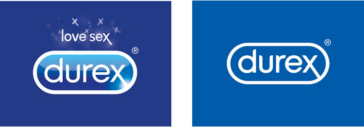
Durex can definitely be playful, (crazy, fun, exiting, risqué, etc) in their campaigns – all they need to do is add their new, safe logo and they’re covered. The non-intrusive nature of the logo furthers the concept that the focus is on the experience, the protection is a given.
The brand’s recent campaign revolves around sexual stigmas and taboos which are based on their findings form a 2017 survey. Tag lines such as ‘porn’s not the norm’ and ‘STD’s are kinda real’ adds a playful tone to serious matters.
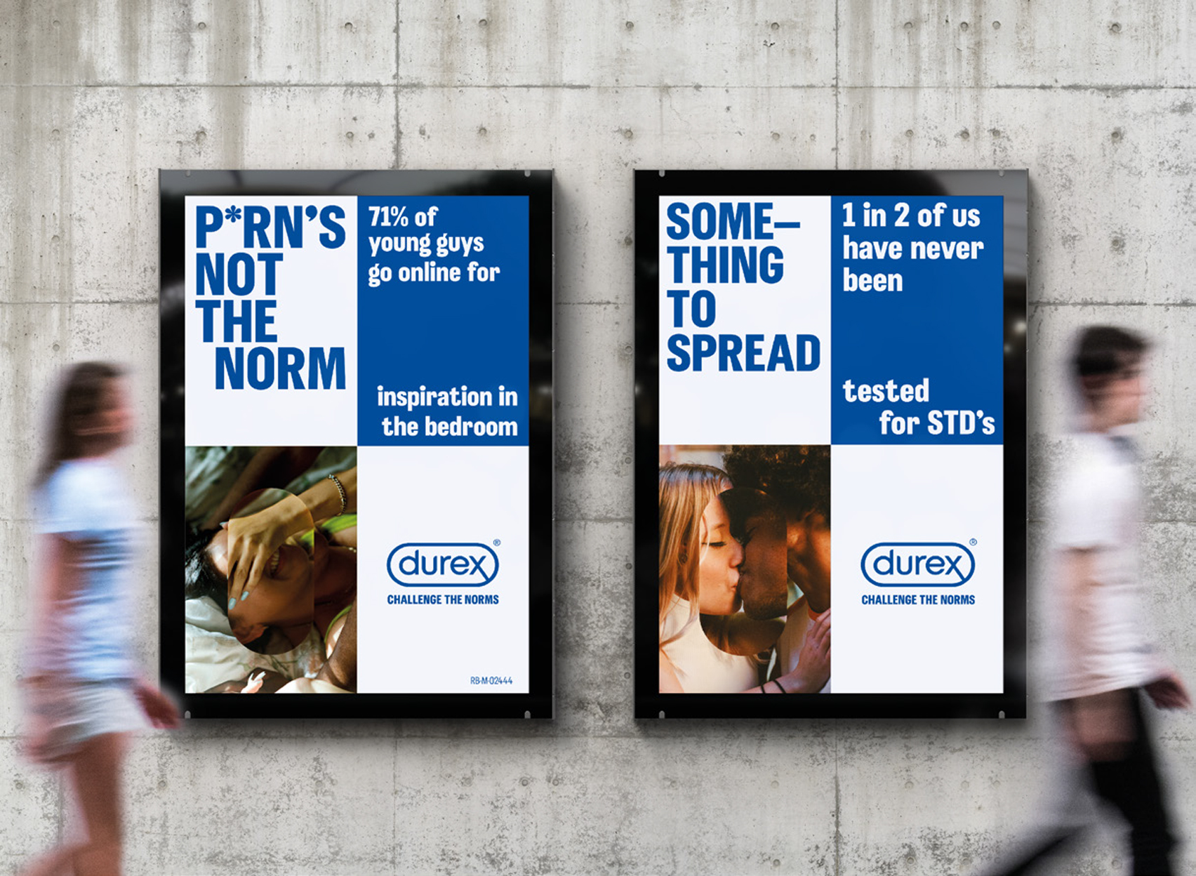
Overall, Durex has managed to not only raise awareness of the importance of safe sex, but it does so in a non-threatening, non-judgemental way. The balance between their messaging, imagery and logo design is hitting the spot.
So while I’m not blown away by the logo update, the overall brand refresh works. It reflects the trustworthiness of the brand, creates a perfect analogy for safe sex and reiterates that you can do whatever you want, be with whomever you want to be with… just be safe.
You could say that Durex nailed it.